
It's them.
The NFL's joyless suits, artistically tone-deaf, penny pinching killjoys, have decided that there was apparently just TOO MUCH creativity and variety in the annual logo for the "big game."
About this time last year, the league decided to "streamline" a bunch of stuff. Namely, they re-did the AFC & NFC championship trophies (welcome and long overdue) but then went too far by declaring that the Super Bowl logo would be a bland, gray phallic edifice to the Lombardi Trophy.
Year, after year, after year.

Great job, dummies.
The NFL has historically introduced a dramatically different Super Bowl logo every year based primarily on the location of the game, and using roman numerals for greatest impact. Landor’s strategy for the new visual identity system places at the heart of it the Vince Lombardi trophy, given to the Super Bowl’s winning team each year. Depending on the NFL event, the new system allows for complementary elements to be introduced. The released version, for the Arlington 2011 Super Bowl XLV, is the first example of a region-specific identity which will include each year’s stadium venue and the roman numerals to designate the event. This system affords the NFL consistency from year to year, regardless of the playoff event.I wish they had re-considered. Because this crap actually, really, bums me out.
Go ahead and rip me for being a geek. Go ahead and say how "it doens't matter, only who wins and loses the game matters!"
You are wrong. You just don't know it.
The annual SB Logo is a visual collectible. A signpost to help you remember, instantly, the time, place and teams involved in the big game. It's bad enough that most of us can't quickly translate roman numerals and correlate them to years. Worse that the regular season and the Super Bowl do not occupy the same calendar year.
But now, with this generic-ass Lombardi-centric logo that is going to replicate like a bunch of Terminators for as far as the eye can see into the future, good luck remembering off hand which Super Bowl was which.
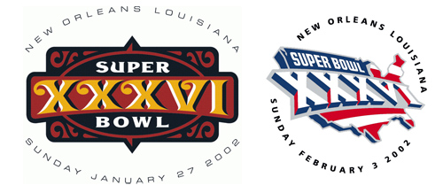
Perhaps my favorite Super Bowl logo of all time, was the New Orleans logo post-9/11.
Then I found out thanks to the mega-land of all things sports logos, Chris Creamer's SportsLogos.net, that there was a PRE-9/11 logo already cooked up for that game, which the league happily dispensed with to go with something more patriotic for reasons that were obvious. Here's what it looked like.
A recent column by Charles P. Pierce on Grantland.com, lauded Patriots coach Bill Belichick as not just a great coach, but also as the NFL's last great "anarchist." His larger point, however, dovetails with the un-necessary and nobody-asked-for-it logo-standardization program.
For years now, the undeniable fact about the National Football League has been that the whole operation is grimly determined to combine the unpredictability of an Amway seminar with the giddy good humor of the North Korean army. This problem has grown especially acute under the recent stewardship of Commissioner Roger Goodell, who seems to imagine himself on a balcony in Buenos Aires, tossing money to the peasants. There was a time, and not so long ago, when the NFL was full to its gunwales with entertaining miscreants of all varieties. Then the Collective assimilated the American Football League, and the steady march toward corporate sports nirvana — i.e., authoritarian tedium on which you can bet — went to the double-quick. Which is why all those people who spend so much time complaining about the No Fun League should embrace Bill Belichick, because Bill Belichick is the NFL's last real anarchist.
The Olympics could just go to a standard logo with the vaunted 5-rings and slap a city name in helvetica narrow underneath. But they haven't. I hope never do. Because logos are cool.
Czabe,
ReplyDeleteYou are correct, sir. While the logo looks good, I don't want to see it year after year after year.
Now here's my biggest gripe with the event. Why, oh why can't this game be moved to Saturday evening/night? Without doubt, this is the biggest sports party of the year. Having it played on Sunday just kills fun. Let's have this spectacle on Saturday evening, where it belongs.
These lame-ass logos are proof of "mailing it in" at the highest level. Crash their servers. Say hell no to generic stamps.
ReplyDeleteAnyone else having problems with getting the podcasts on Itunes? Even listening straight from the Yahoo podcast site cuts off whole segments
ReplyDeleteCzabe, you're absolutely right. The newly homogenized Super Bowl logo is an incredibly bad idea. Logos are powerful things, particularly when they represent an annual event that is almost 50 frickin' years old! But they are also part of the character and identity of each game: no 2 Super Bowls are gonna be the same, and I figured the NFL understood that the logos partly symbolized this. Clearly I was wrong to presume that they could perceive such a sentiment...
ReplyDelete